Coffeenade. Coffee lemonade cans
Details
- Client
- Coffeenade
- Category
- Packaging
- Created
- 2023
- Service
- Packaging design in Riga
Ouff Grafik, in collaboration with BS Agency, designed the packaging for Coffeenade, a new brand of coffee lemonade. The goal was a design that reflects the unique taste of the drink and attracts a young audience. The result is three 330 ml cans, Lemon Coffee, Matcha Coffee and Red Berries Coffee, each in its own colour.
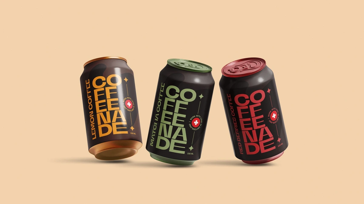
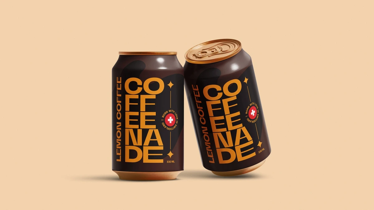
We began by immersing ourselves in the world of coffee and lemonades, studying trends and the preferences of the target audience. The research gave us the elements the design had to carry. The brand itself describes its drinks as coffee-infused sparkling drinks, as energizing as coffee and as refreshing as lemonade. The can itself is dark, with one oversized word on it.
A round badge with a Swiss cross reads “Born with love in Switzerland”, and the volume, 330 ml, sits in small type at the foot. Soft darker shapes in the can’s dark brown body add depth without taking attention from the lettering.
The research pointed to three aims. Energy and freshness: bright colours and dynamic shapes convey the invigorating effect of the drink. Naturalness: natural shades suggest the quality of the product. A trendy, modern style: a minimalist design and concise typography follow current packaging trends.
01 — 04
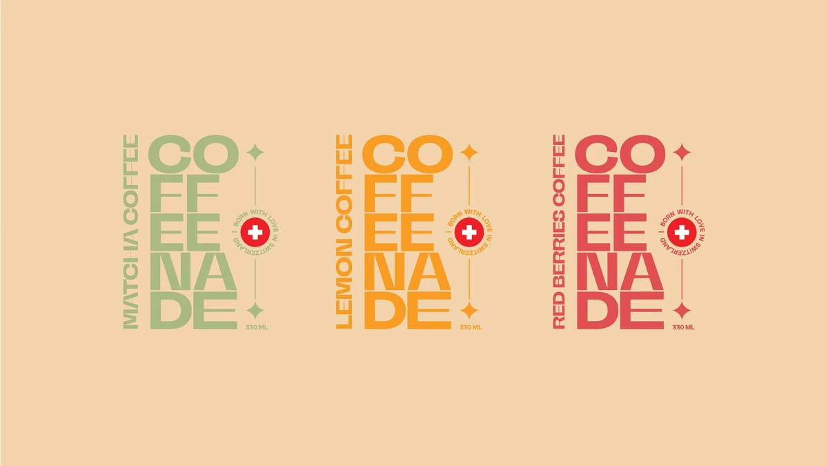
The brand name is split into four lines, CO, FFE, ENA and DE, set in heavy extended capitals that fill the front of the can. The flavour runs vertically along the left edge in narrower letters, next to a thin line with four-pointed stars at its ends.
Contrasting colours, simple geometric shapes
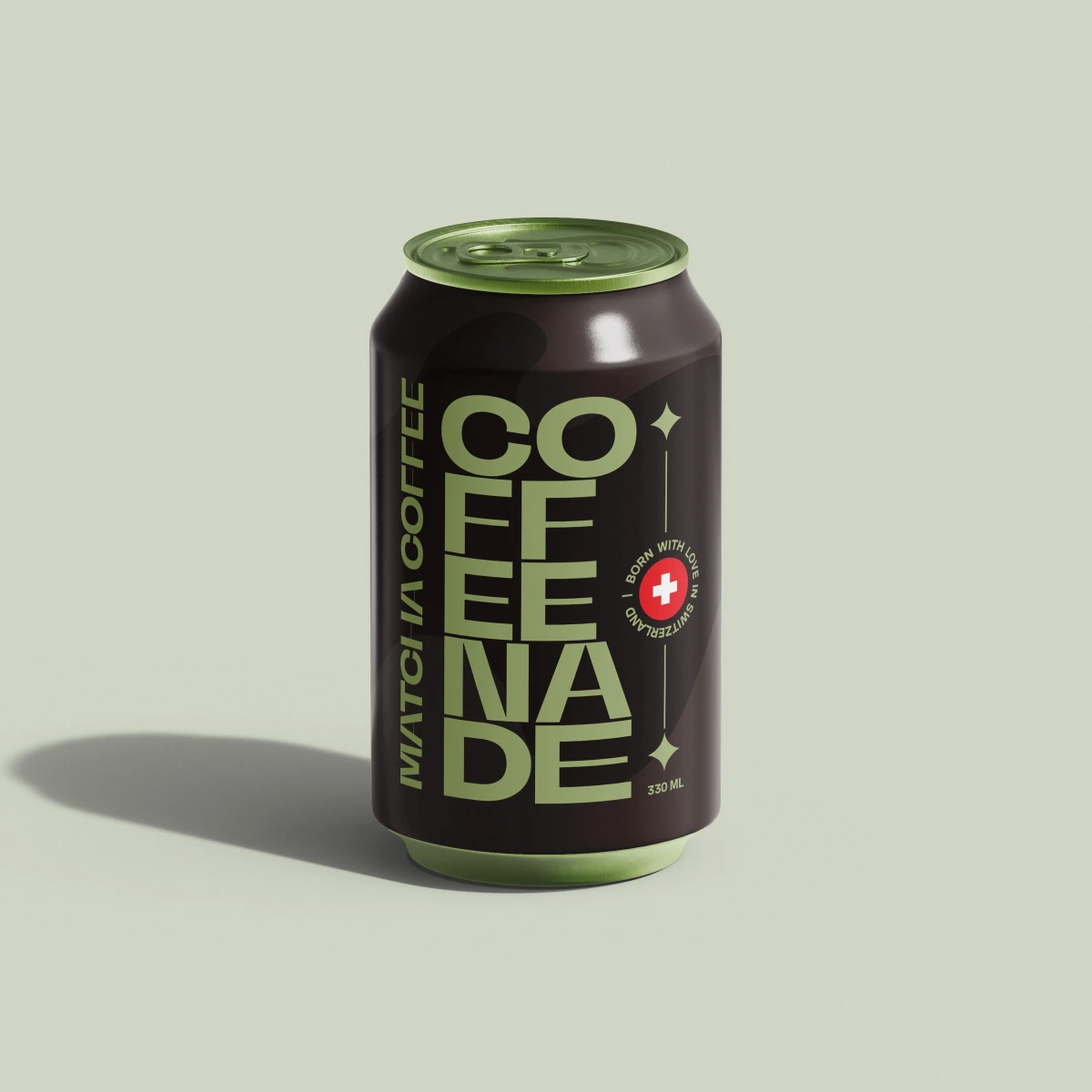
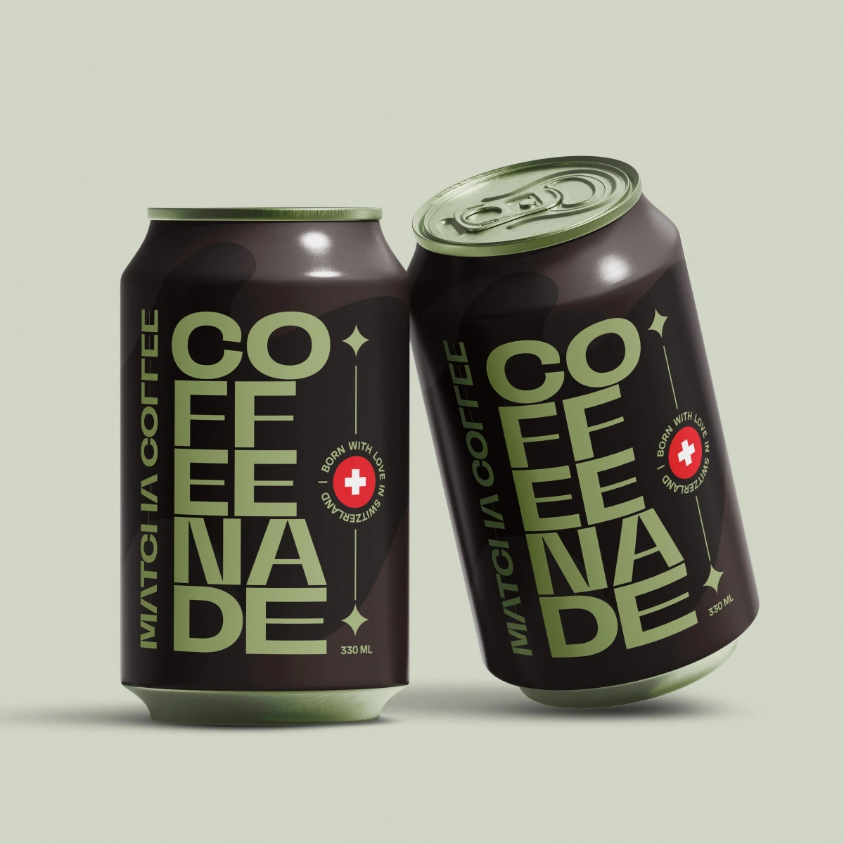
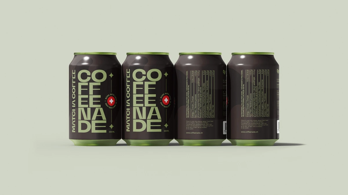
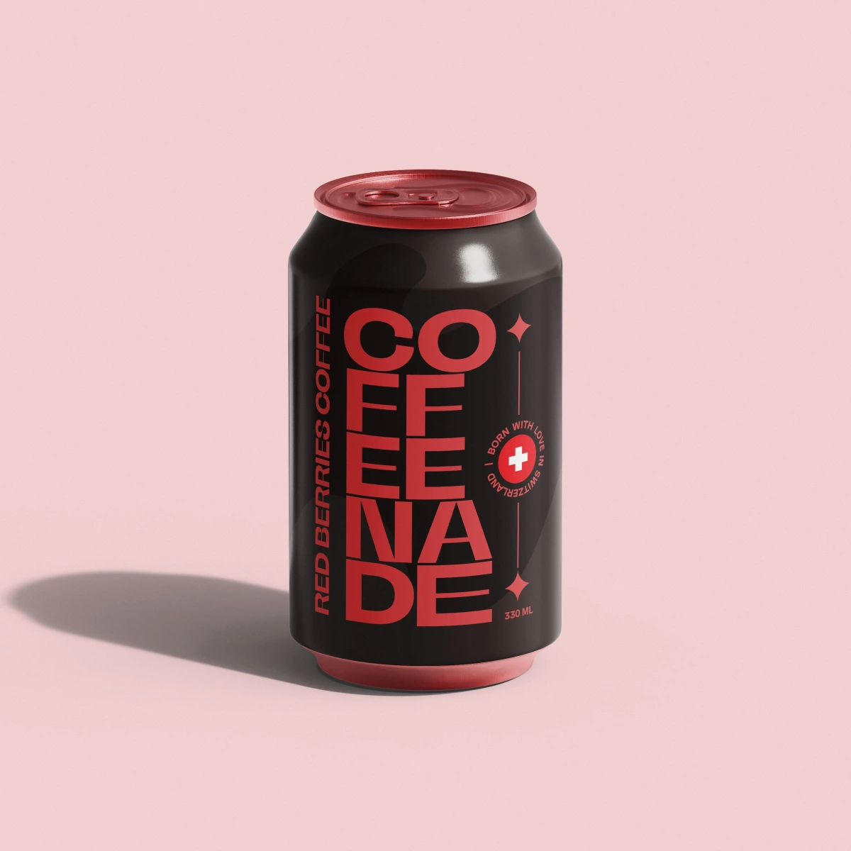
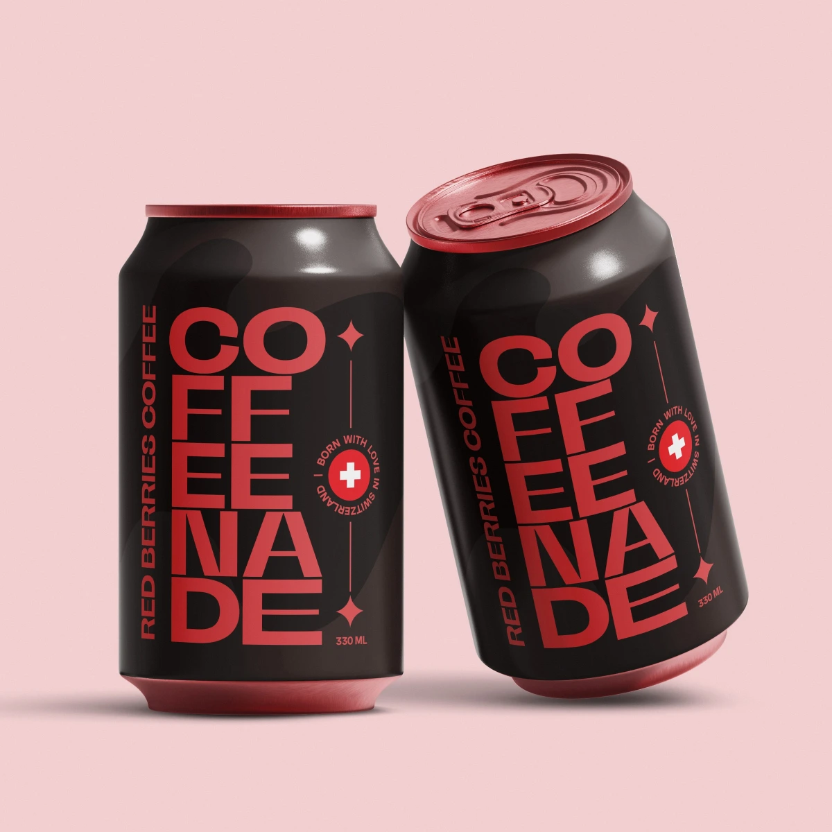
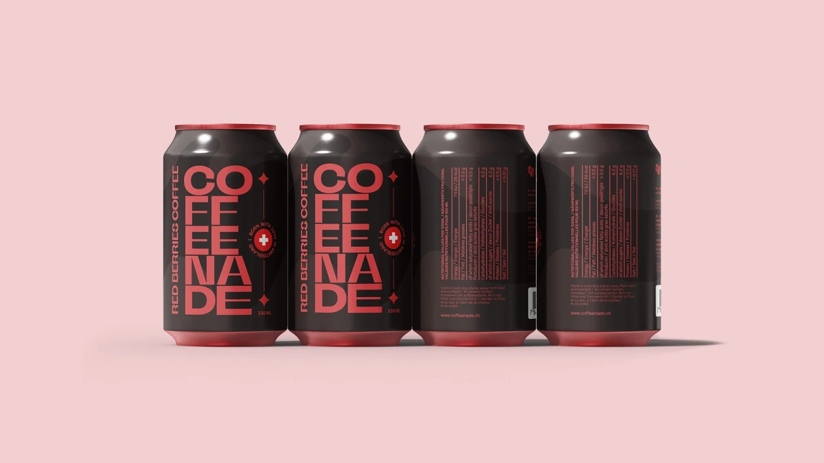
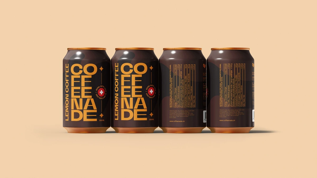
Each flavour has its own palette and its own graphic accent. Lemon is amber-orange with a copper lid, matcha is sage green with a green lid, and red berries is coral red with a red lid. The lettering colour on the dark body gives the strongest contrast. The back repeats the colour for the nutrition table and the web address.
The photos show the three cans floating on warm beige, and each flavour in a row of four cans, two fronts and two backs, on a soft plain background.
The packaging has become an integral part of the brand and communicates its values: energy, freshness and naturalness. Ouff Grafik worked on it in 2023, the year the Coffeenade brand started in Geneva.