Jerky Sticks. Meat snack packaging
Details
- Client
- Nakotne
- Category
- Packaging
- Created
- 2023
- Service
- Packaging design in Riga
For Nākotne, Ouff Grafik designed the packaging of Jerky Sticks, a pork meat snack in stand-up pouches. The design joins bold lettering, product photography and a strong colour for each flavour. The contrast between the flat colour and the texture of the meat gives the pack its character.
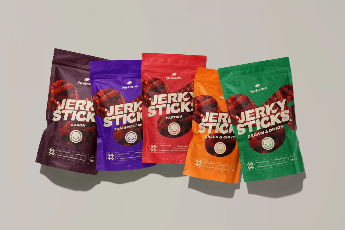
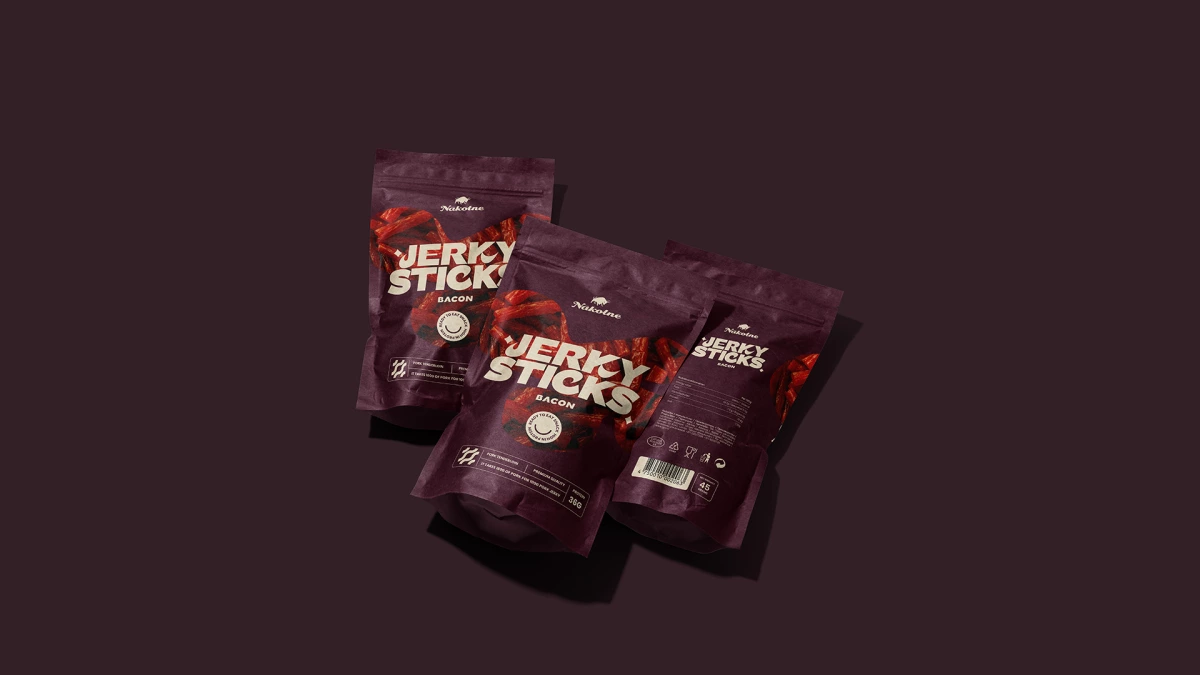
The composition is built around the word JERKY. The oversized lettering, set in two lines of rounded capitals, becomes part of the picture and makes the product easy to recognise. Behind it is an organic, blob-shaped field with a close-up photo of the meat sticks, so the texture of the product is the first thing the eye meets. The lettering overlaps the edge of the field, which ties the word and the photo together.
The flavour sits right under the name in small capitals. The Nākotne logo, a small animal figure above the brand name, stays at the top on a separate colour field, where it is visible without competing with the main message.
Each flavour has its own pouch colour: dark aubergine for bacon, purple for Thai sweet chili, red for paprika, orange for cheese and chives, green for cream and onion. The lettering stays cream on every colour, so the name reads the same across the range and only the colour changes.
01 — 02
Throughout the design process we looked for a balance between an appetising presentation, expressive graphics and a clear hierarchy of information. The line that goes with this project: Meat. Flavour. Nothing extra.
A bold new format for snacking on the go
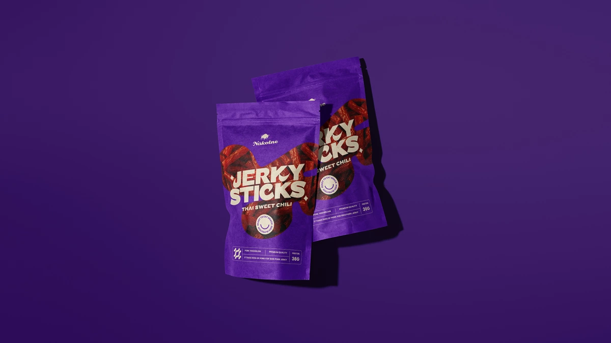
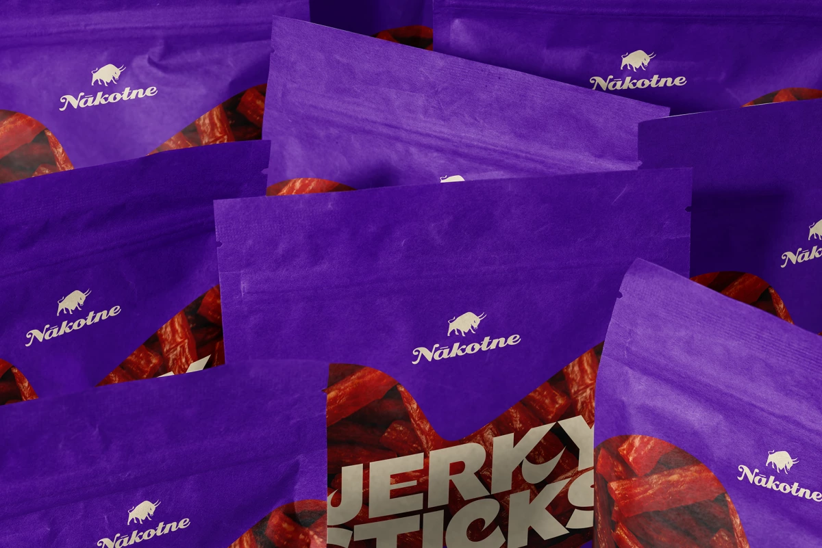
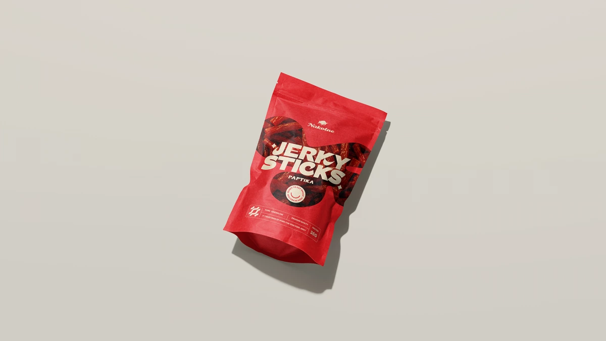
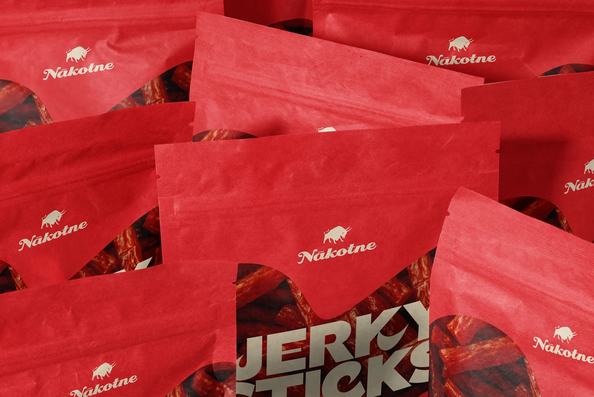
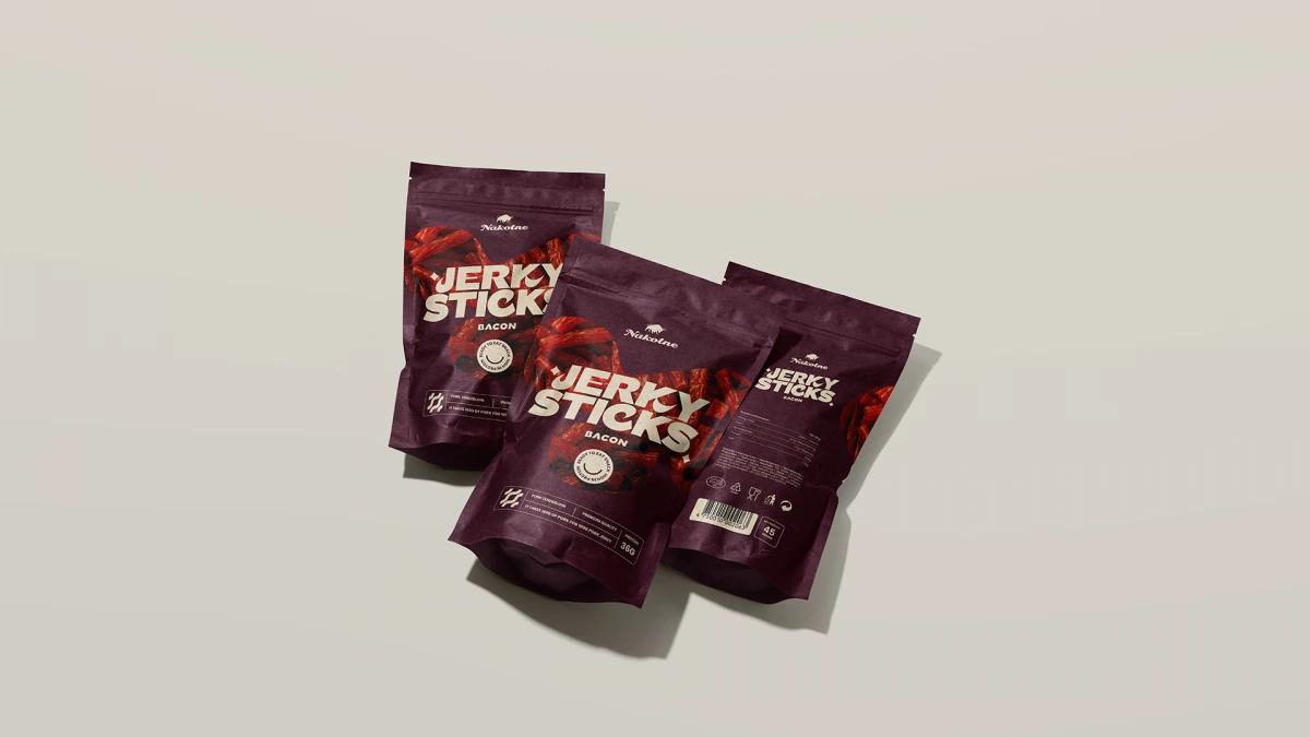
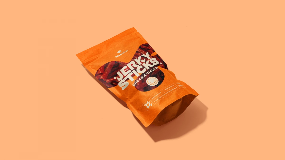
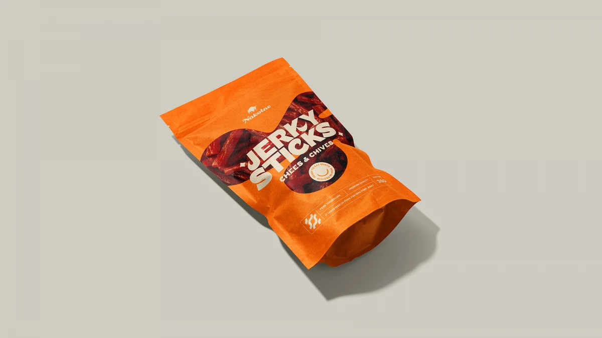
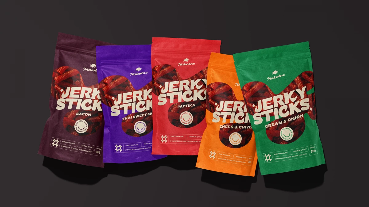
A round smiley badge on the front reads “Ready to eat snack” and “High in protein”. A thin information bar at the bottom of the pack lists the meat, pork tenderloin, the quality line, premium quality, and the protein content, with a small icon at its left. The back has the barcode, small icons and the product text.
In the visuals the pouches have a matte, paper-like texture. They stand side by side on warm grey and on black, and as single packs on purple and cream.
Jerky Sticks is a familiar favourite in a bold new format for snacking on the go. The pouches read fast: one word, one colour and one flavour name on each pack. Ouff Grafik worked on the pack in 2023.