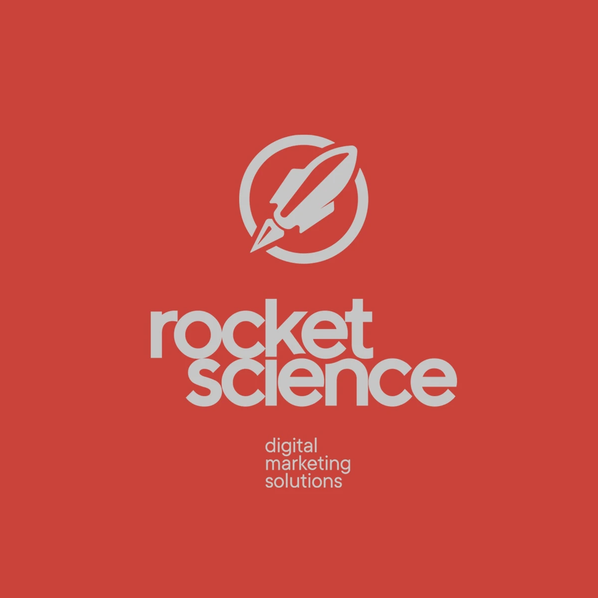
Rocket Science. Marketing agency logo
Details
- Client
- Rocket Science
- Category
- Logo Design
- Created
- 2022
Rocket Science is a digital marketing agency in Riga. Its services cover analytics, advertising, SEO, content marketing, brand strategy and design. We designed the logo and carried it onto stationery: a letterhead, business cards and a printed card, all in one red, white and black scheme.
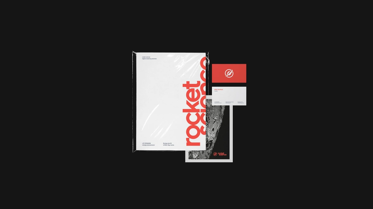
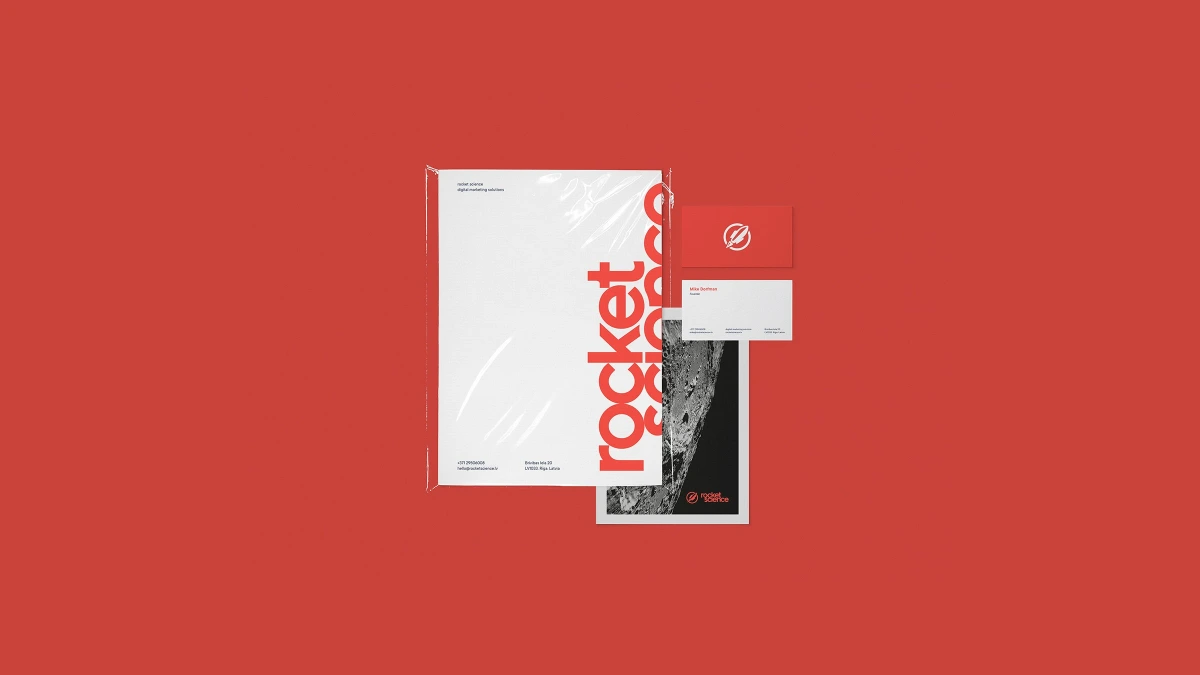
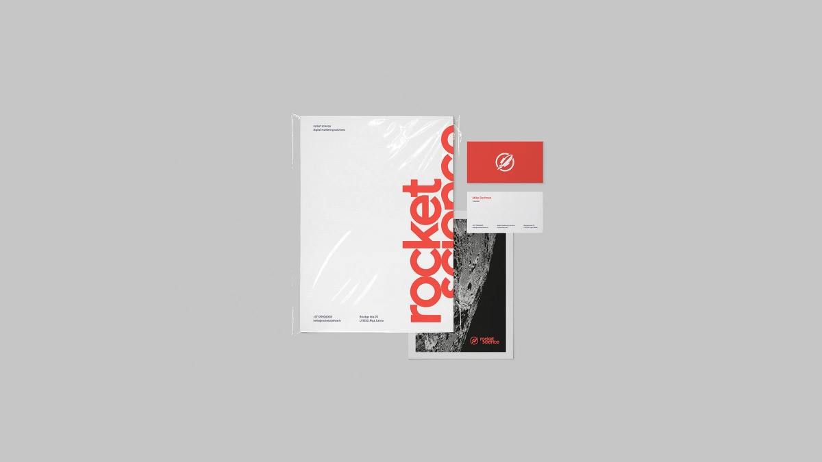
The mark takes the name literally. A rocket climbs inside a white ring, and its tail breaks through the ring at the lower left, as if the rocket is leaving orbit. Under it the wordmark is lowercase, set in a rounded geometric sans-serif on two lines, “rocket” over “science”, with the line “digital marketing solutions” in a light weight below.
The round letters and the lowercase give the name a friendly voice. The rocket is a solid white shape with a few cut-out lines for the fins, so it keeps its detail when it is printed small on a business card.
The palette is a warm coral red with white and near-black. The logo appears in white on red, in red on white and in red on black, so it works on each of the colours used for the sheets and cards.
01 — 03
The letterhead carries the name vertically along its right edge in large red letters, with the second word cropped by the sheet. Contact details sit at the foot in small type. A black card pairs the small logo with a grey photograph of the Moon’s surface.
A clear idea, drawn simply
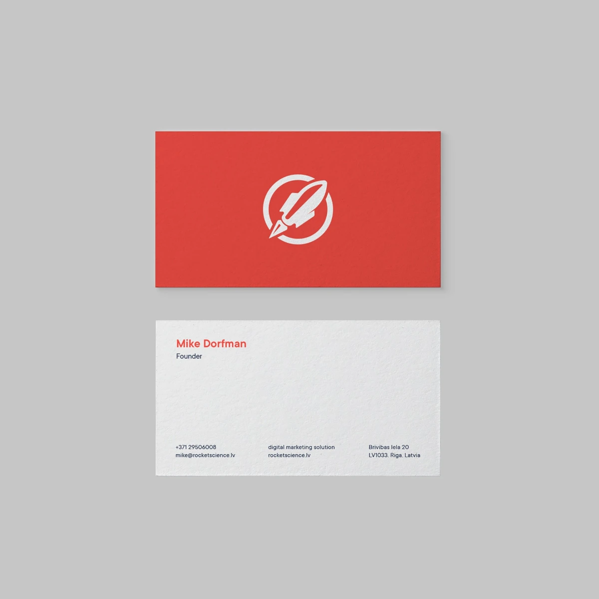
The business card has the white rocket mark on red on the front. The back is white, with the founder’s name and title in red, and the phone number, email, web address and street address in small dark type. The set is shown on red, black and grey backgrounds, so the brand colour fills the picture in the first version.
A printed card on the same sheet uses a black field, the Moon photograph and the logo in red, which gives the stationery one darker, quieter piece next to the red and white ones. In the cover images the sheet, the cards and the printed card lie in a loose, overlapping stack.