The Good Mood Kitchen — logo and granola packaging
Details
- Client
- Good Mood
- Category
- Logo Design. Packaging
- Created
- 2020
The Good Mood Kitchen is a food brand, and this project is about its granola. Ouff Grafik designed the logo and the packaging for a line of three granola flavours, with labels in Latvian.
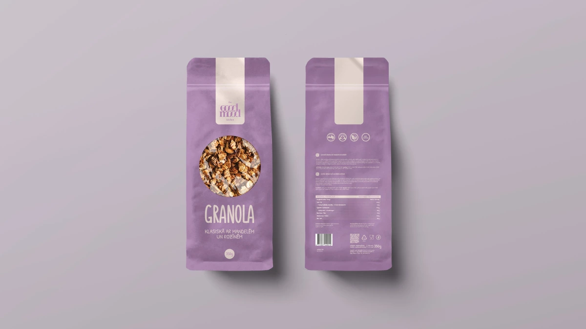
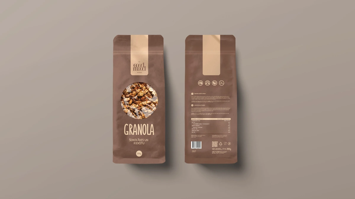
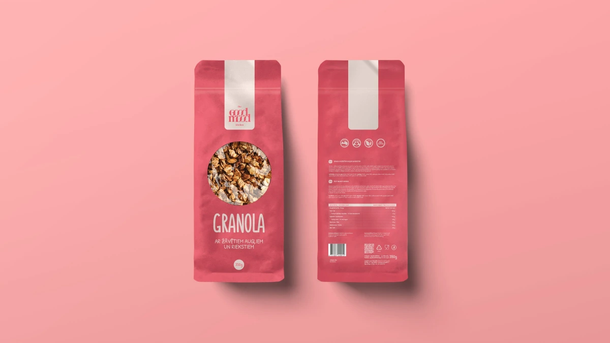
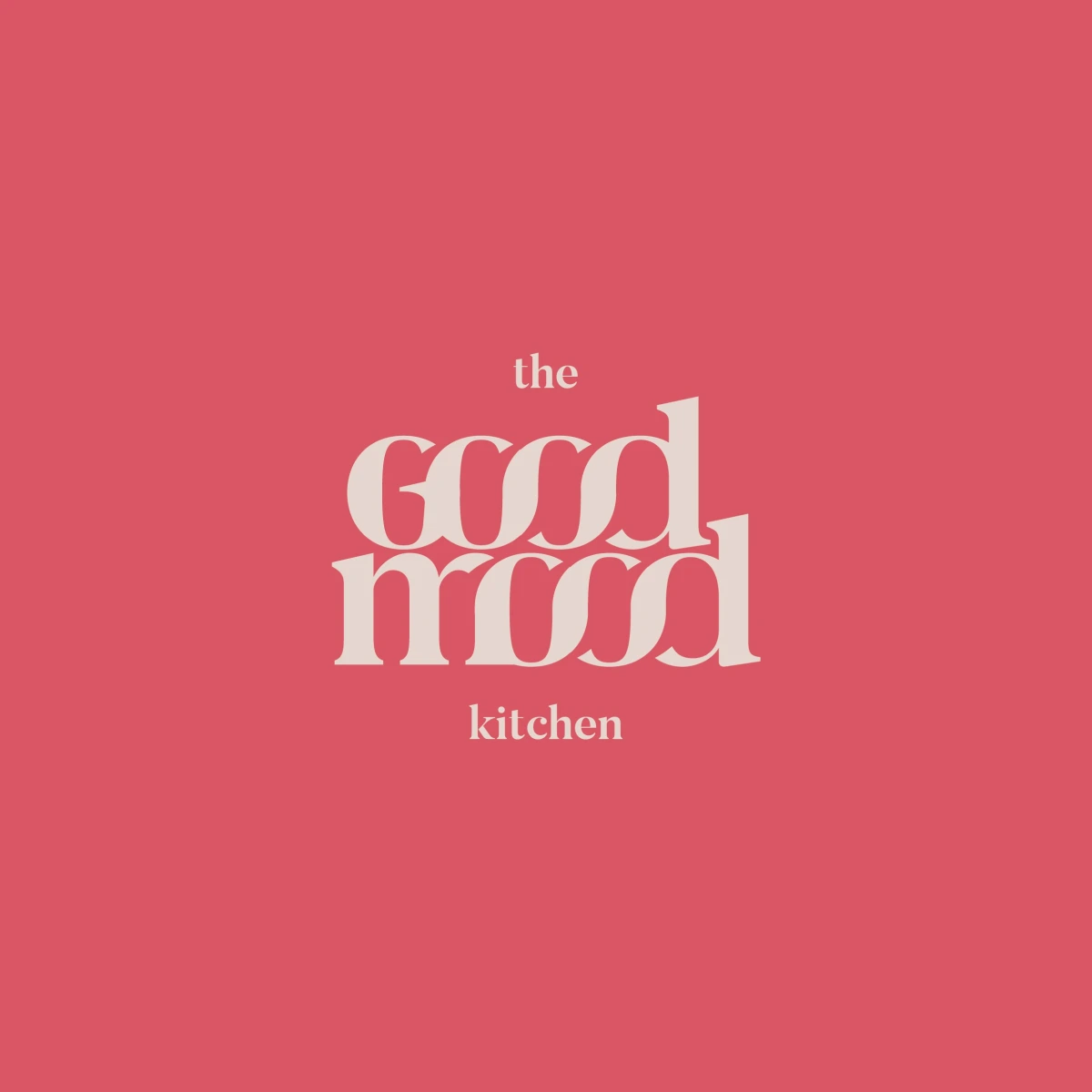
Design: a logo with the feeling of a good mood — soft, rounded and a little playful. “Good” and “mood” are stacked into one compact shape where the round letters overlap and flow into each other, framed by a small “the” above and “kitchen” below.
The wordmark is a high-contrast serif with interlocking, curling letters, shown in cream on raspberry pink, lavender and cocoa brown. The stand-up pouches use the same palette, one colour per flavour: a cream vertical band carries the logo, a round window shows the granola inside, and “GRANOLA” is set in hand-drawn capitals above the flavour name. The back keeps the band and adds icons, ingredient and nutrition text and a barcode.
01 — 03
Three flavours, three colours, one good mood.
The pouch layout stays the same for every flavour — only the colour and the flavour line change, so the range reads as one family and each variant is easy to tell apart.