Rahbarber: bold graphics for a barber shop in Riga
Details
- Client
- Rahbarber
- Category
- Logo Design. Graphic Design
- Created
- 2020
Rahbarber is a barber shop in Riga. Ouff Grafik designed its logo and a set of graphic materials around the slogan “Rock the cut”: stickers, postcards, pin cards, business cards and a price list.
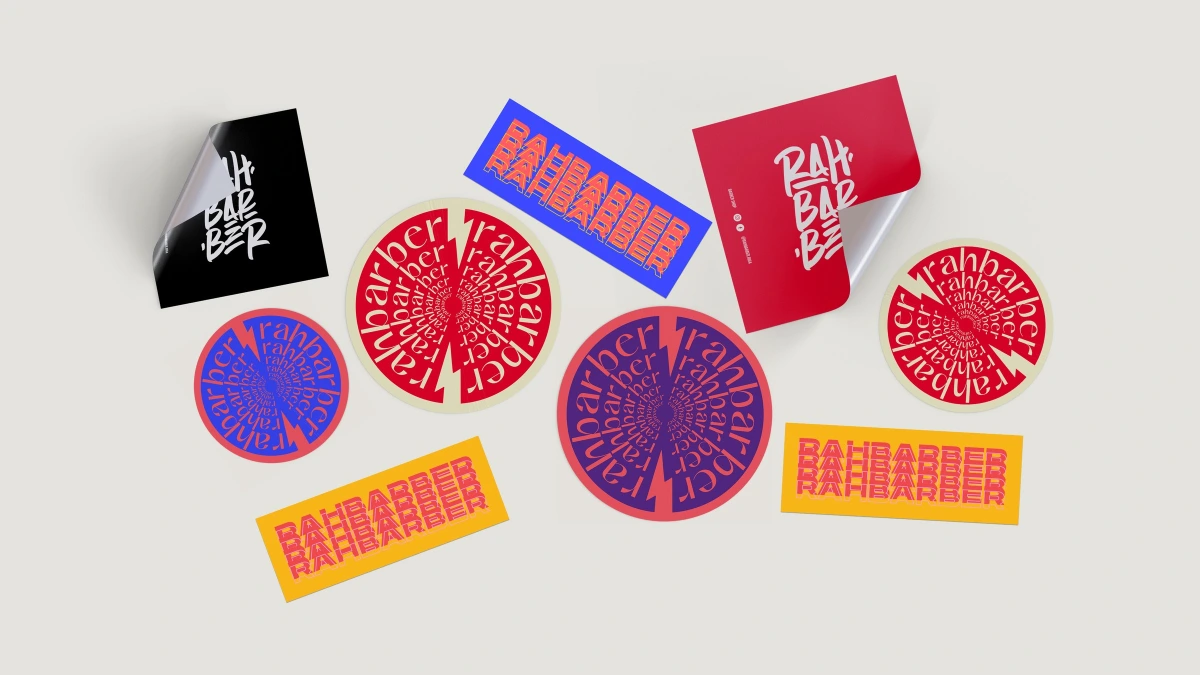
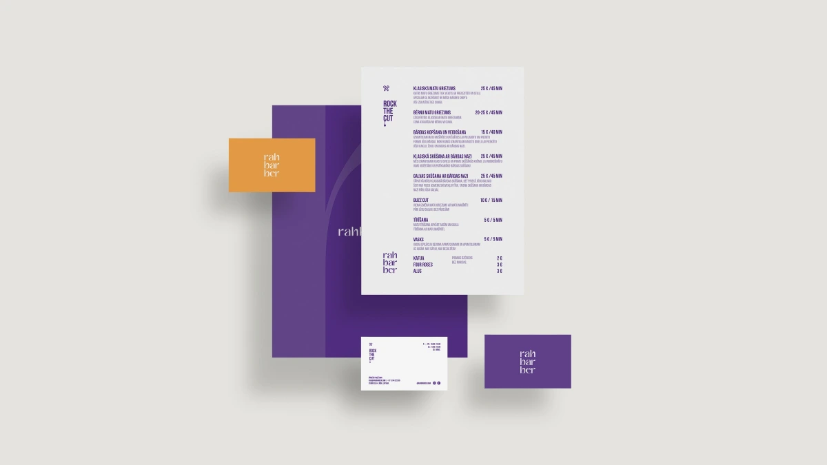
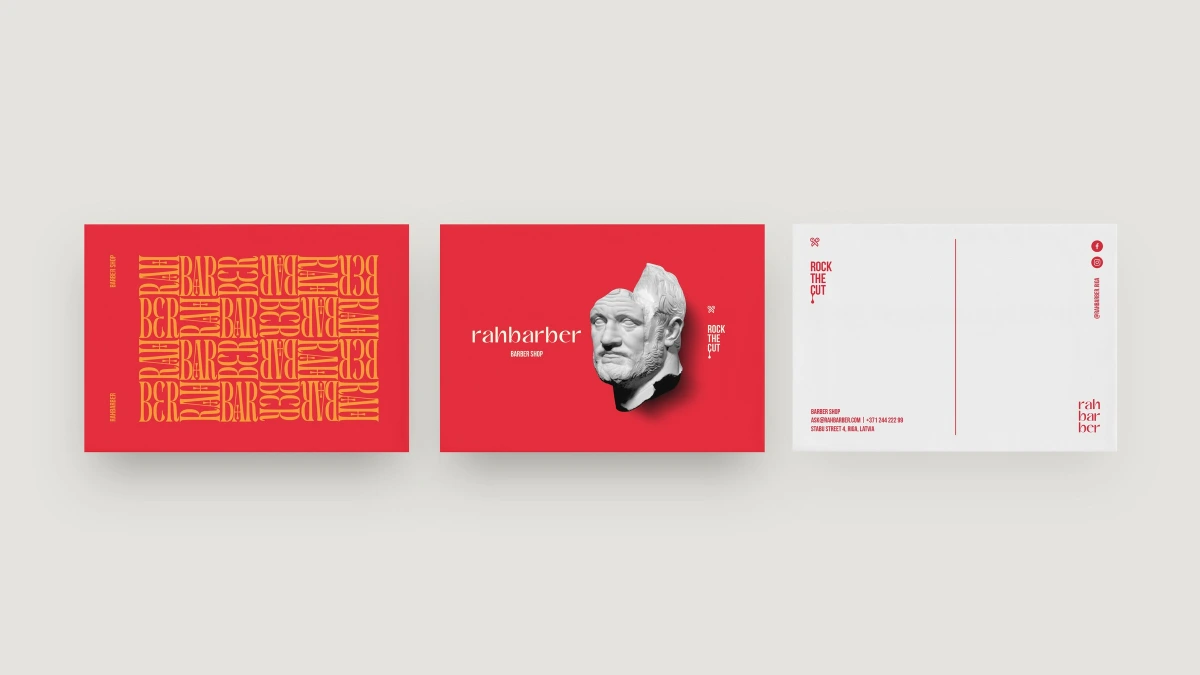
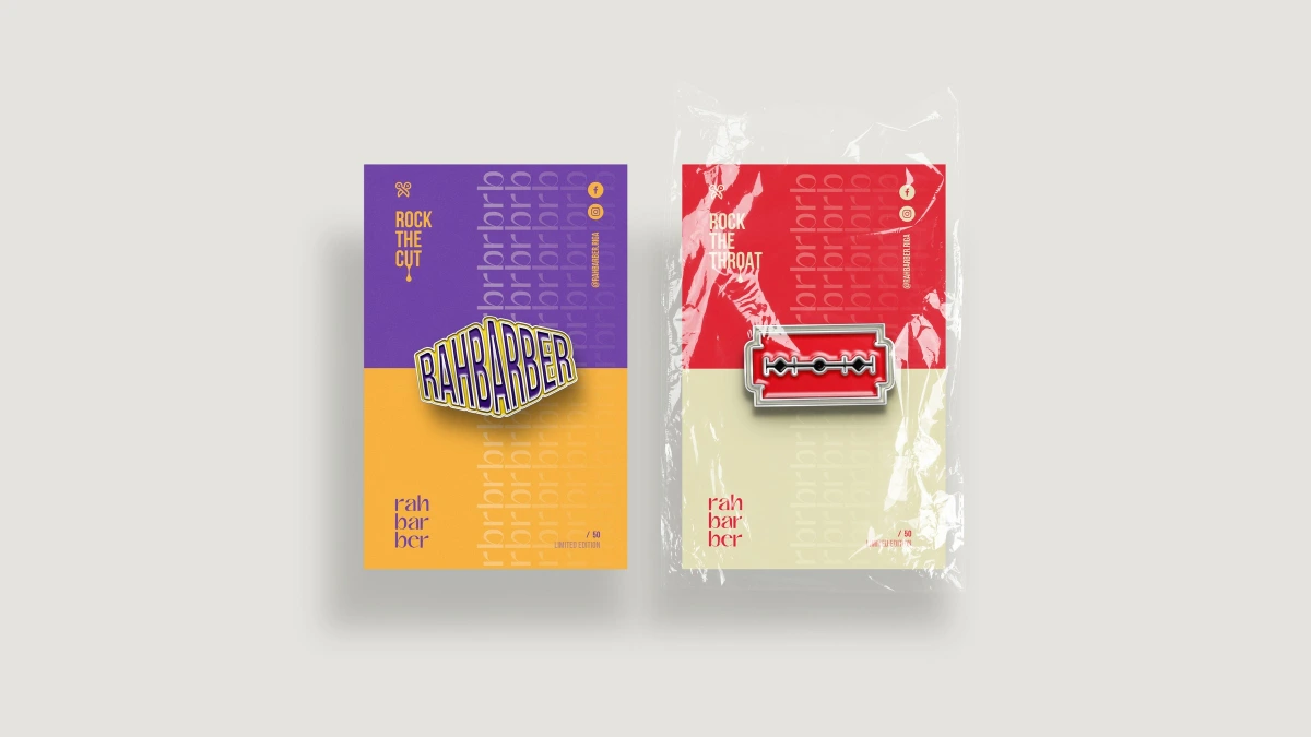
Design: the name is split into three syllables — rah / bar / ber — and stacked in a lowercase serif. Around this calm wordmark the graphics get loud: the letters are repeated, stretched, twisted into spirals and split by a lightning-like zigzag.
The palette combines red, purple, orange-yellow and cream. Alongside the serif logo there is a hand-lettered brush version and stretched outline lettering used on badges. The postcard shows a classical marble bust split in two next to the “Rock the cut” slogan; the pins are a razor blade and a Rahbarber badge.
01 — 04
A classic serif with a rock-and-roll attitude.
The identity runs across round and rectangular stickers, postcards, enamel pins on printed backing cards, business cards, a folder and a price list in Latvian.