Shine Agency: a wordmark with a wave inside the letter H
Details
- Client
- Shine Agency
- Category
- Logo Design. Brand Identity
- Created
- 2021
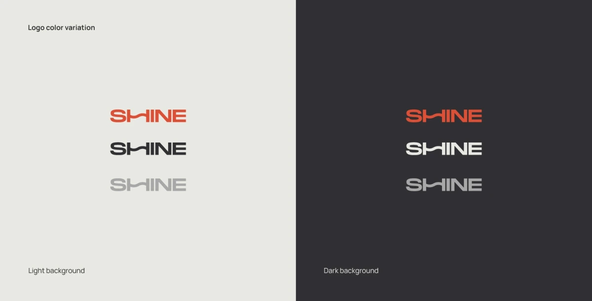
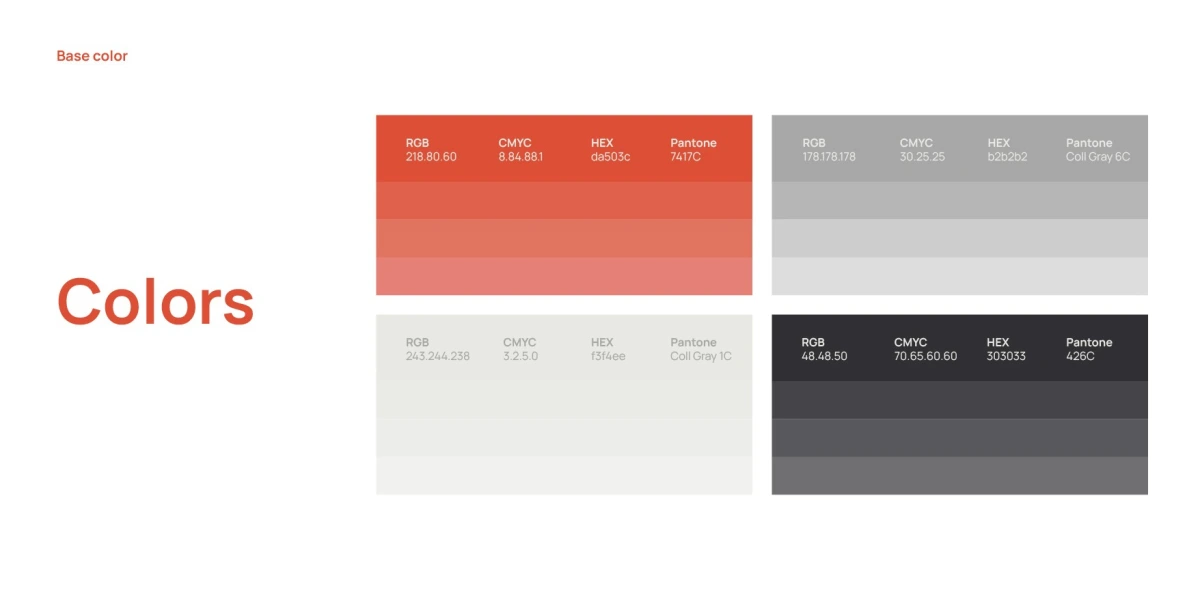
For Shine Agency, Ouff Grafik designed the logo and brand identity. The guidelines cover logo colour versions, construction, the key graphic element, the colour palette and typography.
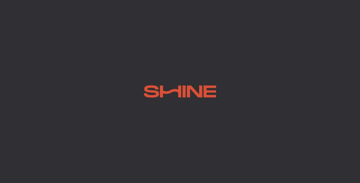
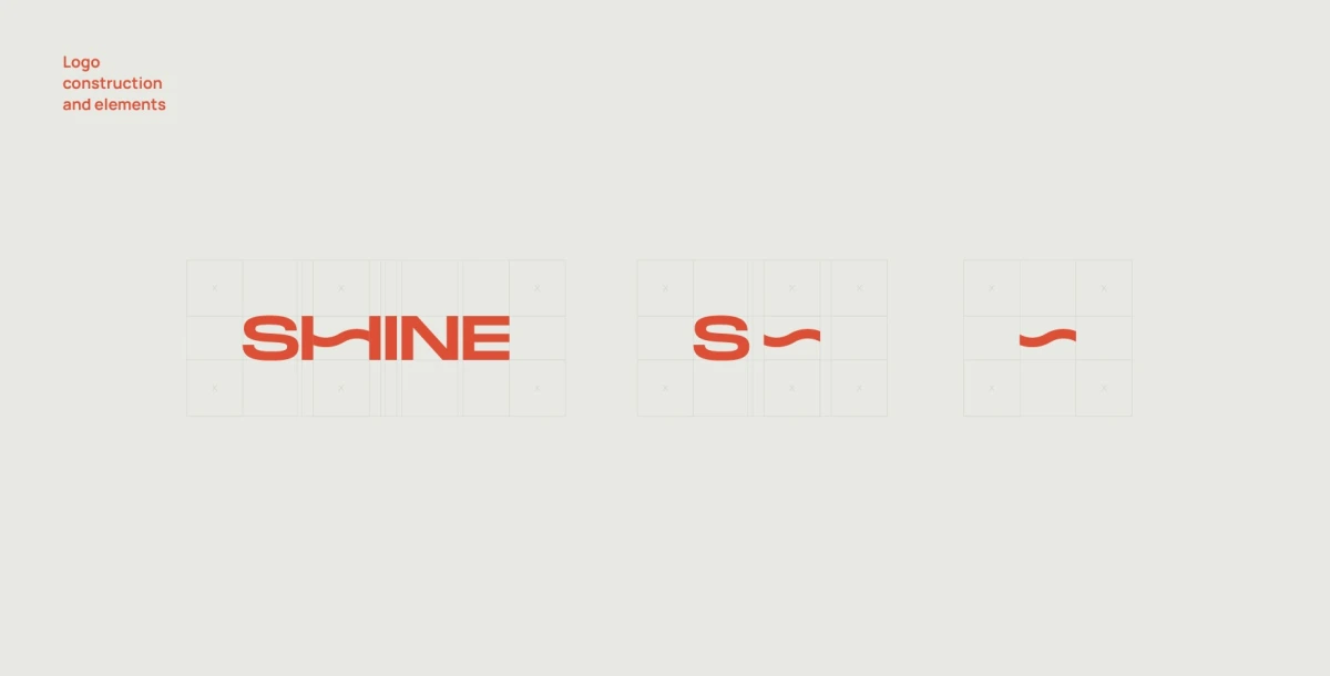
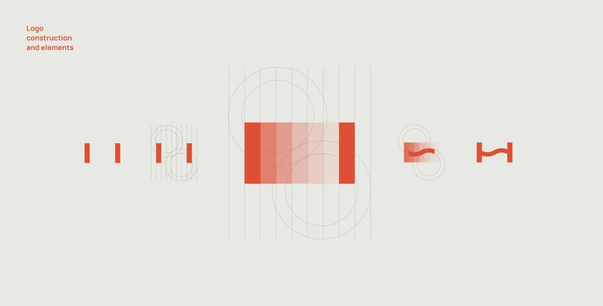
Design: the SHINE wordmark is set in wide capitals, and the crossbar of the H is replaced by a wave. Paired with the letter S, this wave — “S~” — became the main element of the identity.
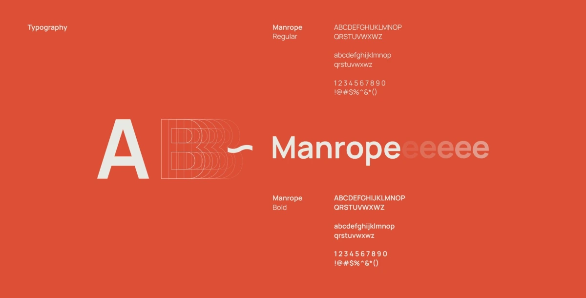
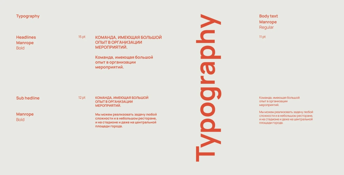
The palette pairs orange-red with dark graphite, supported by light and mid greys; each colour is specified in RGB, CMYK, HEX and Pantone. On light backgrounds the logo works in orange, dark and grey, on dark ones in orange, white and grey. The typeface is Manrope in Regular and Bold, for headlines and body text. The wave repeats into a line pattern and appears in outline versions.
01 — 03
One wave turns a word into a sign.
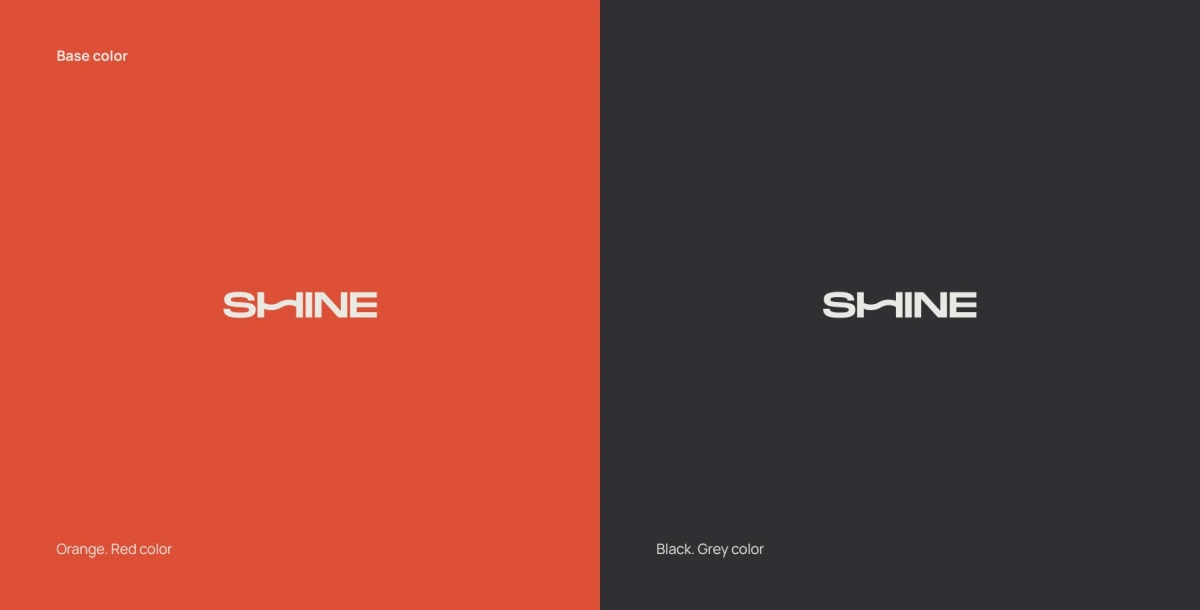
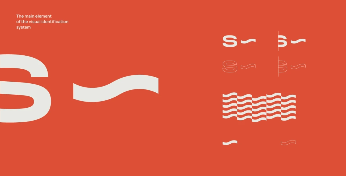
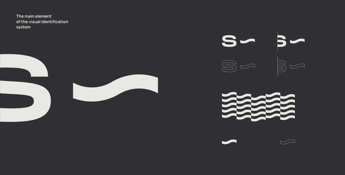
The S and the wave work at any scale: cropped large as a supergraphic, repeated as a wave pattern or reduced to a single small wave on orange and dark backgrounds.