Valeria Ivanova. Personal brand logo
Details
- Client
- Valeria Ivanova
- Category
- Logo Design. Brand Identity
- Created
- 2020
Valeria Ivanova works with service businesses. Her own materials describe a complex approach to their improvement and development, drawing on psychology, marketing, service standards and coaching. We designed her logo and personal brand identity: a monogram, a name seal and a thin line that runs through the stationery.
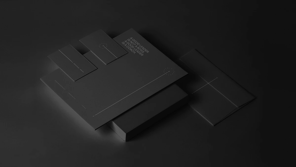


The brand is a person, so the logo starts from her initials. The V and the I stand on either side of a dash, and the full name runs around them in a small circle, like a seal. The letters in the circle are widely spaced, so the ring reads as a fine line of capitals around the initials, and the same seal repeats at the top of the white letterhead.
The dash is the main idea. It extends into a thin line that leaves the monogram and crosses the envelope as a diagonal, runs down the edge of a business card and continues across the letterhead. On the black envelope it is a single diagonal from the top right corner towards the lower left.
The palette is limited to black, white and grey. The name is set in widely spaced capitals, and the texts use a light, clean sans-serif. One statement is set in bold capitals: “A good leader is not a boss. A good leader is a coach.”
01 — 03
Hairline lines, straight and diagonal, cross the envelopes, business cards and letterhead. They stay thin enough that the set still reads quietly on black paper. On the black letterhead one long line runs from the lower left corner towards the name seal at the upper right.
Black, white and one connecting line
The identity is applied to a letterhead, envelopes, business cards and an all-black stationery set with thin line details. On the white sheet, the name seal sits at the top and the statement stands in bold capitals above a short text about her method. The business cards come in white and black: the white one carries a few lines of small text, the black one a single vertical line.
One layout places the stationery beside a black and white portrait, between a grey envelope and a sheet that reads “A complex approach to the improvement and development of business in the service sector.” In it the dash of the monogram is stretched into a long line that runs behind the portrait, with the V on the left and the I on the right.