Tventix. Website design for payments
Details
- Client
- Tventix
- Category
- Web Design. Dev
- Created
- 2022
Tventix is a payment technology company: a white label payment gateway and e-wallet software for businesses that want to launch their own payment service. We designed its website and visual language: a dark interface, a bold sans-serif, a 3D form as the key visual, product pages for both services, an About section and a contact form.
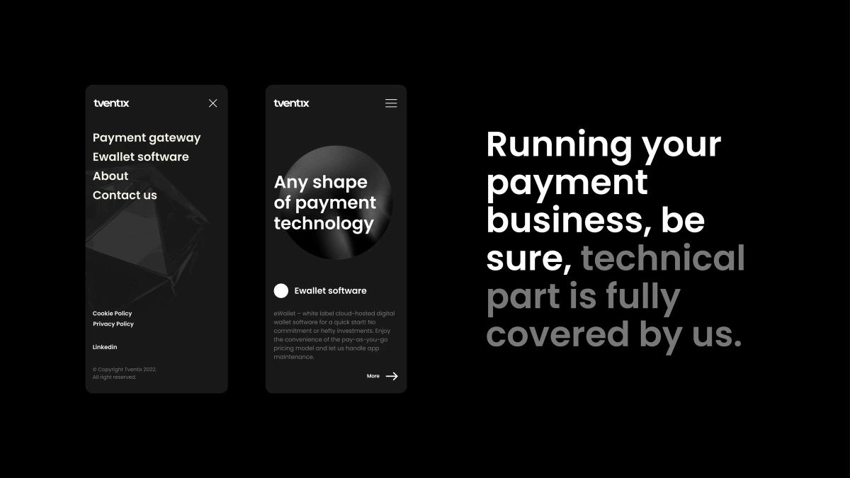
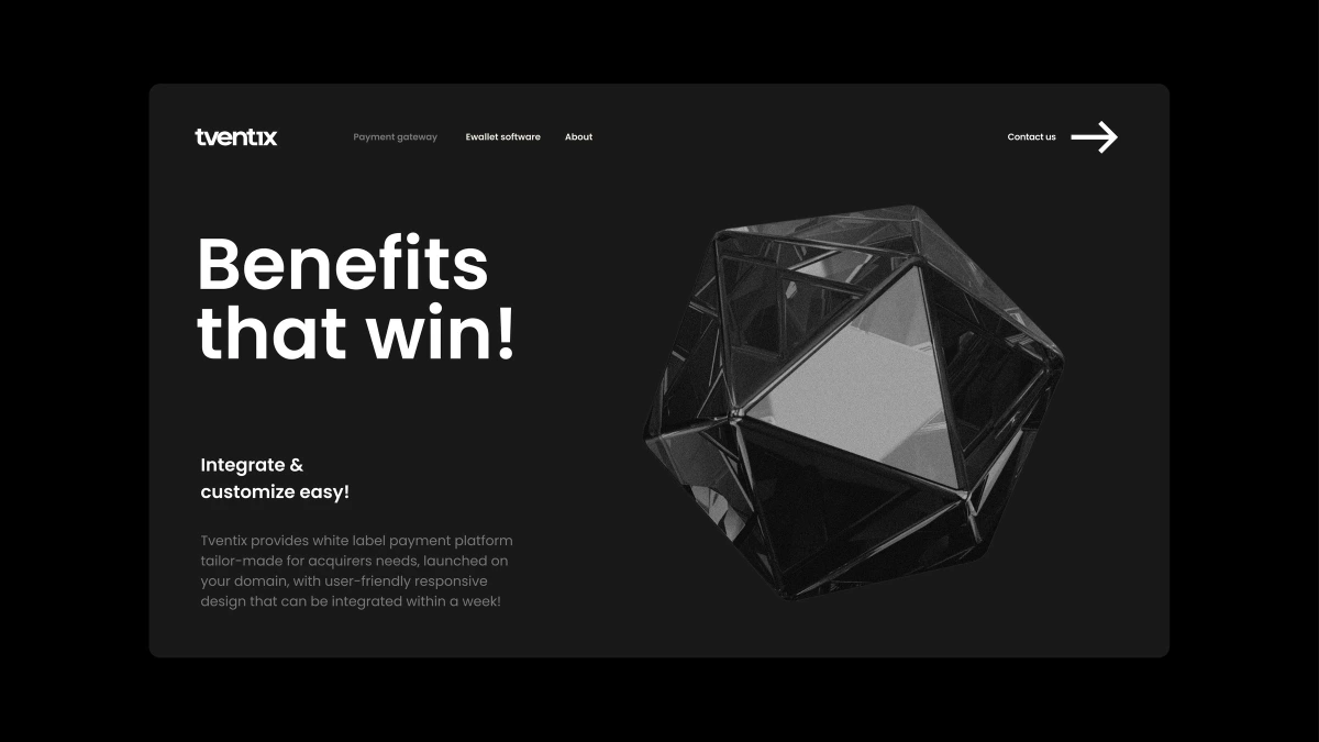

The task was to present a complex technical product simply and with confidence, and to build a visual identity that reflects the brand’s values and mission.
The home page does it with one line, “Any shape of payment technology”. It is set very large over a grainy dark sphere. The two products sit below it side by side, Payment gateway on the left and Ewallet software on the right, each with a short description and a “More” arrow. The menu holds four items: Payment gateway, Ewallet software, About and Contact us. Everything else on the screen is small and quiet, so the headline is the first thing a visitor reads.
The interface is dark and monochrome. Headlines are set in a bold geometric sans-serif, descriptions in lighter grey, and long arrows mark every link, including the Contact us link in the top right corner of every page. A faceted glass polyhedron on the “Benefits that win!” screen is the one sculptural object besides the sphere on the home screen.
01 — 03
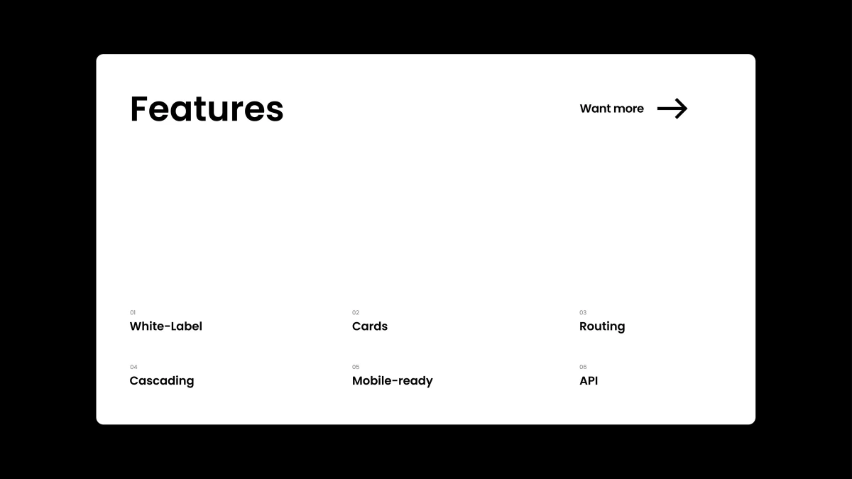
The Features screen turns white. It lists the platform’s capabilities as six numbered items: White-Label, Cards, Routing, Cascading, Mobile-ready and API. A long statement on the next screen, “No need to start from scratch”, is set in white and grey so the first half stands out.
A dark interface for a complex payment product
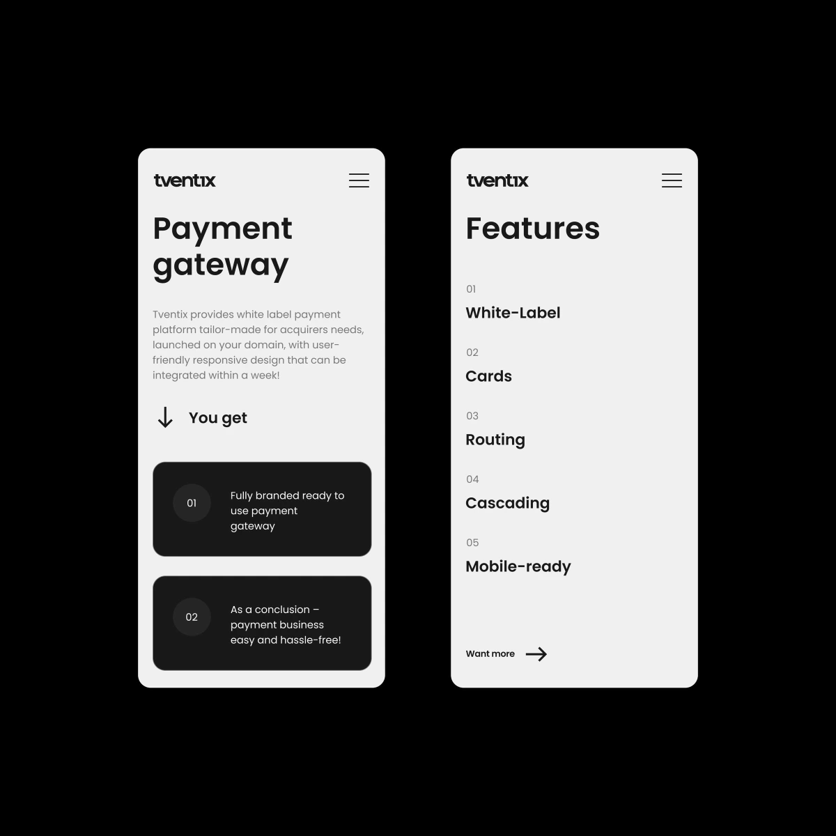
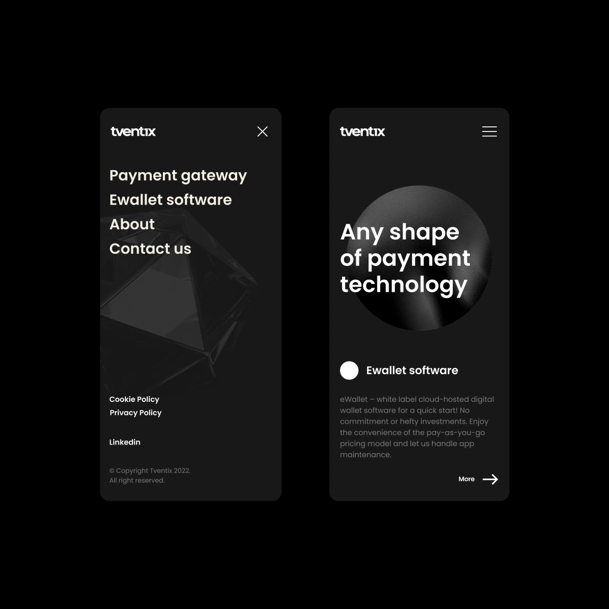
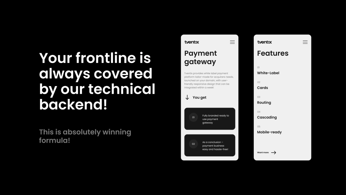
The website works equally well on desktop and mobile: product pages, a features overview, benefits and a contact form follow one clear grid. On a phone the menu opens as a full-screen list of large links over the faded polyhedron, and the headline wraps to three lines beside the sphere. The legal links, Cookie Policy and Privacy Policy, and the LinkedIn link sit at the foot of the menu.
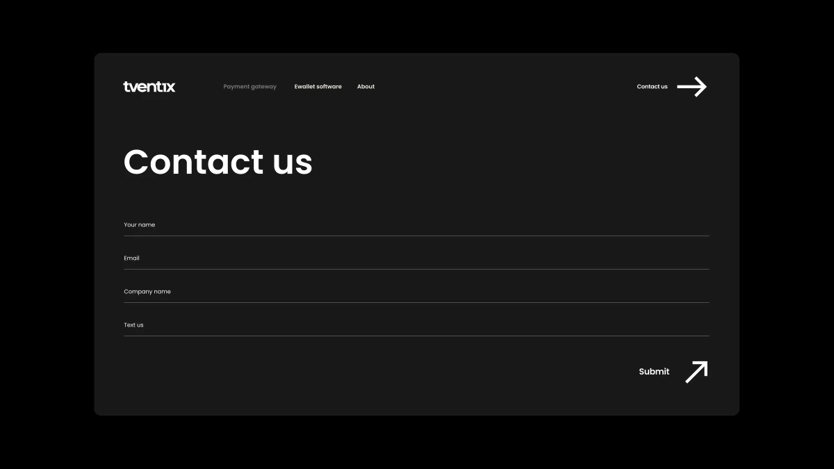
Short, confident headlines carry the message, while the monochrome palette keeps the focus on the product. The Contact us page is a single form with four underlined fields, Your name, Email, Company name and Text us, and a Submit arrow.